There are few design truths that stay consistent year after year. Whether your home is a downtown bungalow or farmhouse retreat, there are a few common mistakes you should avoid. Designing your space should feel fun and exciting, not stressful and overwhelming. You are creating your oasis from the world.
Here’s how to avoid the 8 most common design mistakes.
1 - Ignoring Your Budget
Before your project is underway you should have a pretty clear idea of how much everything will cost. No need to rush and buy more than you can afford at the moment; great spaces are curated over time. Ignoring your budget will create stress down the road. It’s a good idea to search for clearance items first and save money where you can.
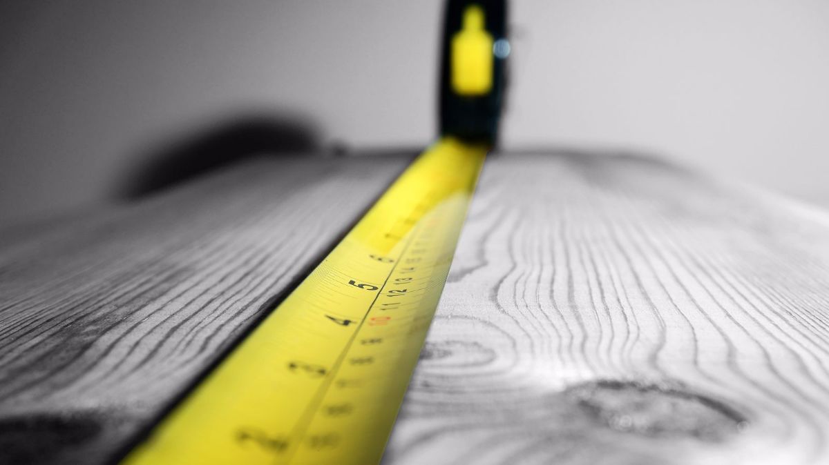
2 - Not Using the Measuring Tape
Before you fall in love with that beautiful sectional in the showroom, make sure it fits into your space: literally. Many people realize too late that their favorite lounge chair is far too small or low compared with their sofa. Make sure to measure all the pieces, doorways, and stairwells before making this costly mistake.
3 - Painting Before Buying Furniture
Picking out colors and painting your walls before purchasing anything is a common design mistake that can be avoided. It is much easier to pick a wall color that will complement furnishings, rather than the other way around. If you really want to incorporate a certain color, try finding larger furniture pieces in that shade.
4 - Ignoring Height
Furniture in a room should be various heights and sizes, elevated in multiple ways. Art, window treatments, and furniture should all be elevated, even just slightly.
5 - Including only Masculine or Feminine Pieces
If you’re looking to make a space more masculine, this does not equate to only using darker shades and vice versa for more feminine spaces. This is a common mistake that can easily be avoided once a balance of lights and darks is introduced into the room.
6 - Artwork Disasters
Incorporating art into your home is a great way to show off your personality and style. Placement of art, however, is where homeowners make a big design mistake. Either placing the art too high or low will throw the room off-balance. Each piece you hang should sit together with the furniture. An easy rule to help avoid this decorating mistake is to keep art only eight to ten inches higher than furniture.
7 - Wall to Wall Furniture
Pushing furniture up against a wall is a decor mistake that is natural to make. Depending on the layout of the room there may not be a way around this, but if you can, you should avoid it. Furniture that is placed up against the walls of any room does not save space. Center your pieces and pull items closer together to create a flow that doesn’t box anyone in.
8 - Being Too Trendy
Design trends are useful to see how other people are styling their homes and can provide great inspiration. However, trends are constantly changing, so a big mistake is to go too trendy. Instead, opt for pieces that are timeless, but most importantly, select furniture that fits your personal style.
Keep things fun and airy, and stick to your budget. Your furnishings should complement your home and your life! Make sure you are choosing items that add style, comfort, and make you truly feel at home.


